


Limestone Advisory Group — Graphic Design, Copy & Digital Media
Overview
Led the creative direction and design of LinkedIn content for Limestone Advisory Group and one of its senior finance professionals. I built a consistent content system across both company and personal pages, shaping post topics, writing captions, and creating simple on-brand visuals that felt professional, insightful, and recognizable.
The work went beyond design, it was about defining how the brand shows up online. By balancing content strategy, messaging, and visual identity, I helped create a scalable framework that kept both pages active, engaging, and aligned with the expectations of a finance-focused audience.
Creative Copy
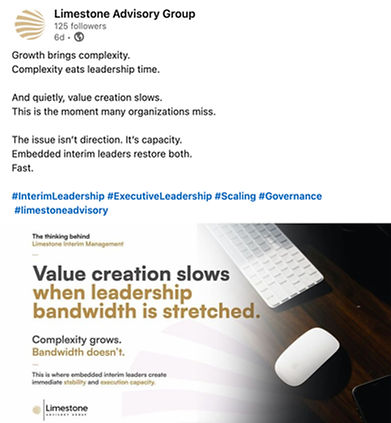
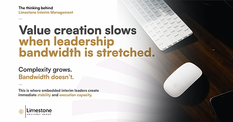
Every post, visual, and caption was created with a clear purpose. The goal was to keep the content professional while making it engaging enough to catch attention on a busy LinkedIn feed.
For the finance audience, I focused on sharing insights, perspectives, and relevant stories rather than just delivering updates. Captions were kept clear and concise, often tied to company news, market trends, or ideas that reinforced the brand's expertise. The tone stayed professional and informed, but approachable—helping the content feel more human and relatable instead of overly corporate.
Strategic Impact
Developing a content system that followed their previous momentum made it easier for the firm to stay consistent on LinkedIn while keeping a professional tone across both corporate and executive profiles. It supported company visibility, helped maintain ongoing engagement, and everything was structured so the team could review and schedule posts without friction.
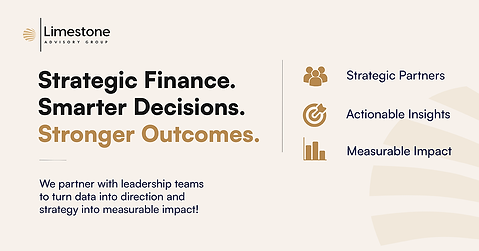
The visuals stayed minimal and clean, built around white space, black and beige tones, and their existing Satoshi font system. Otherwise, photos themselves usually would be curated on their own to maintain a human connection with their followers.
Summary
I refined their layout structure for their LinkedIn content to improve hierarchy and readability without changing their core identity. Posts were mostly type-led with subtle warm accents, curated imagery, and simple compositions that kept everything professional, clear, and easy to digest in a finance context.